Packaging
Packaging
Print
Layout
Typography
Packaging
Print
Layout
Typography
These are a few examples of packaging I’ve done either for fun or for freelance work. I enjoy the challenge of working with specific shapes and fitting the necessary information into sometimes unwieldy dimensions.
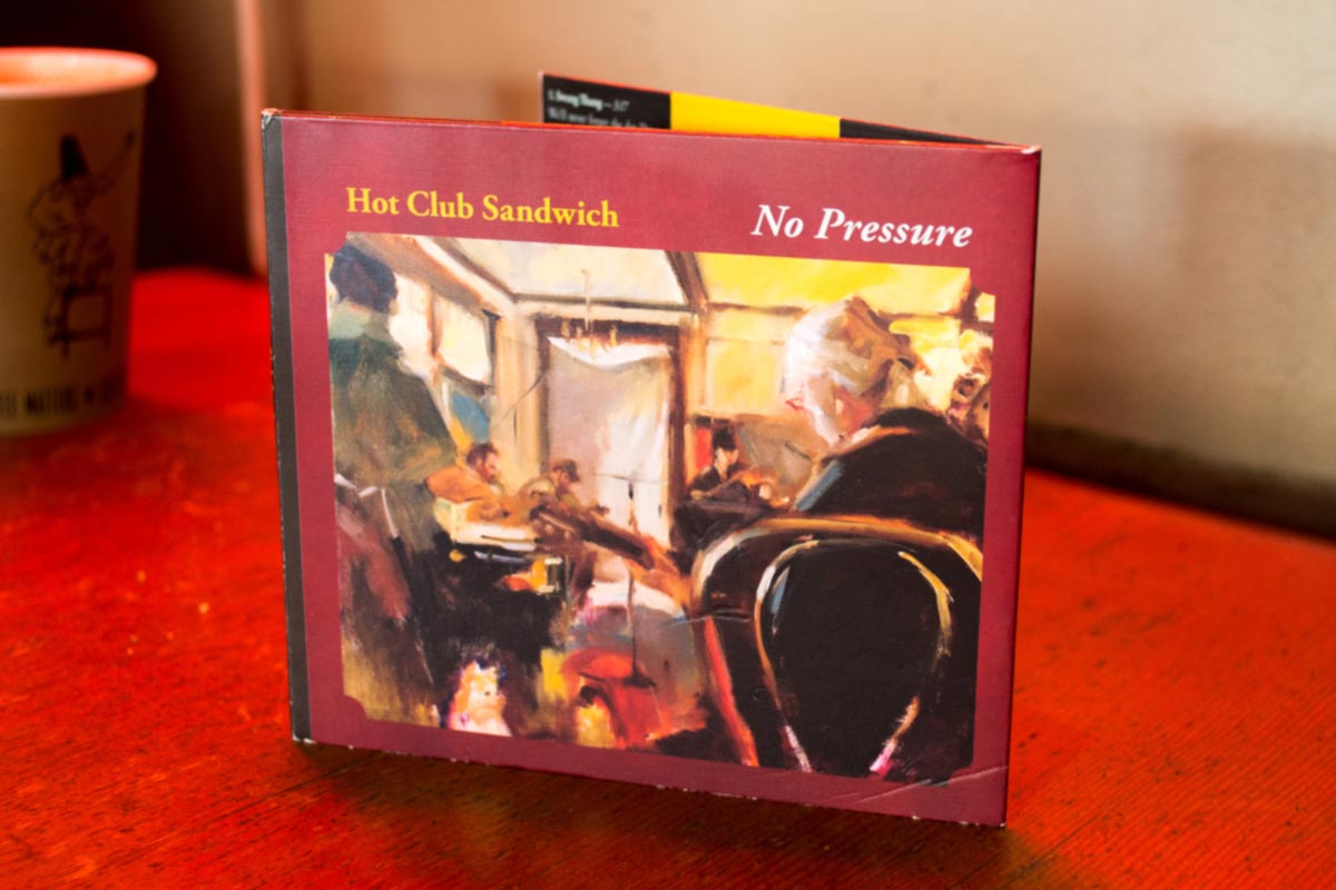
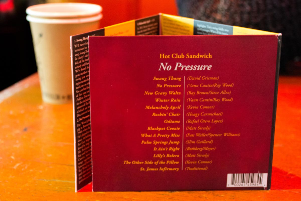
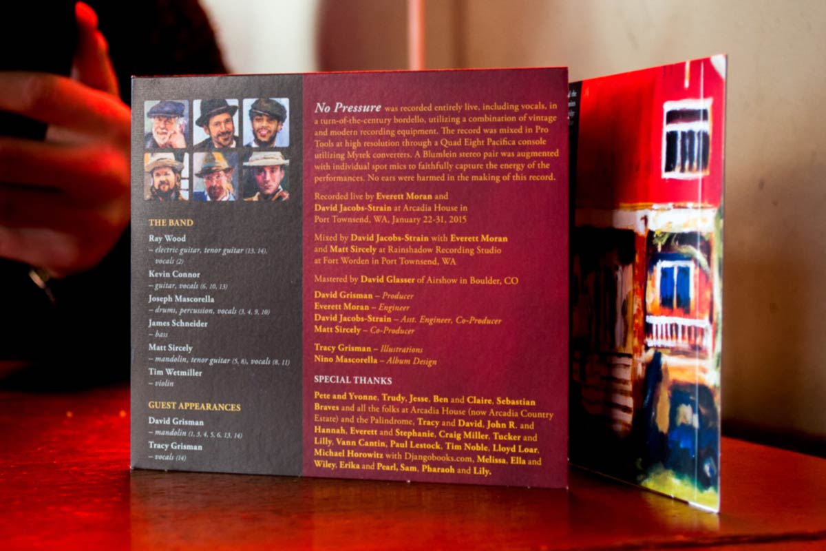
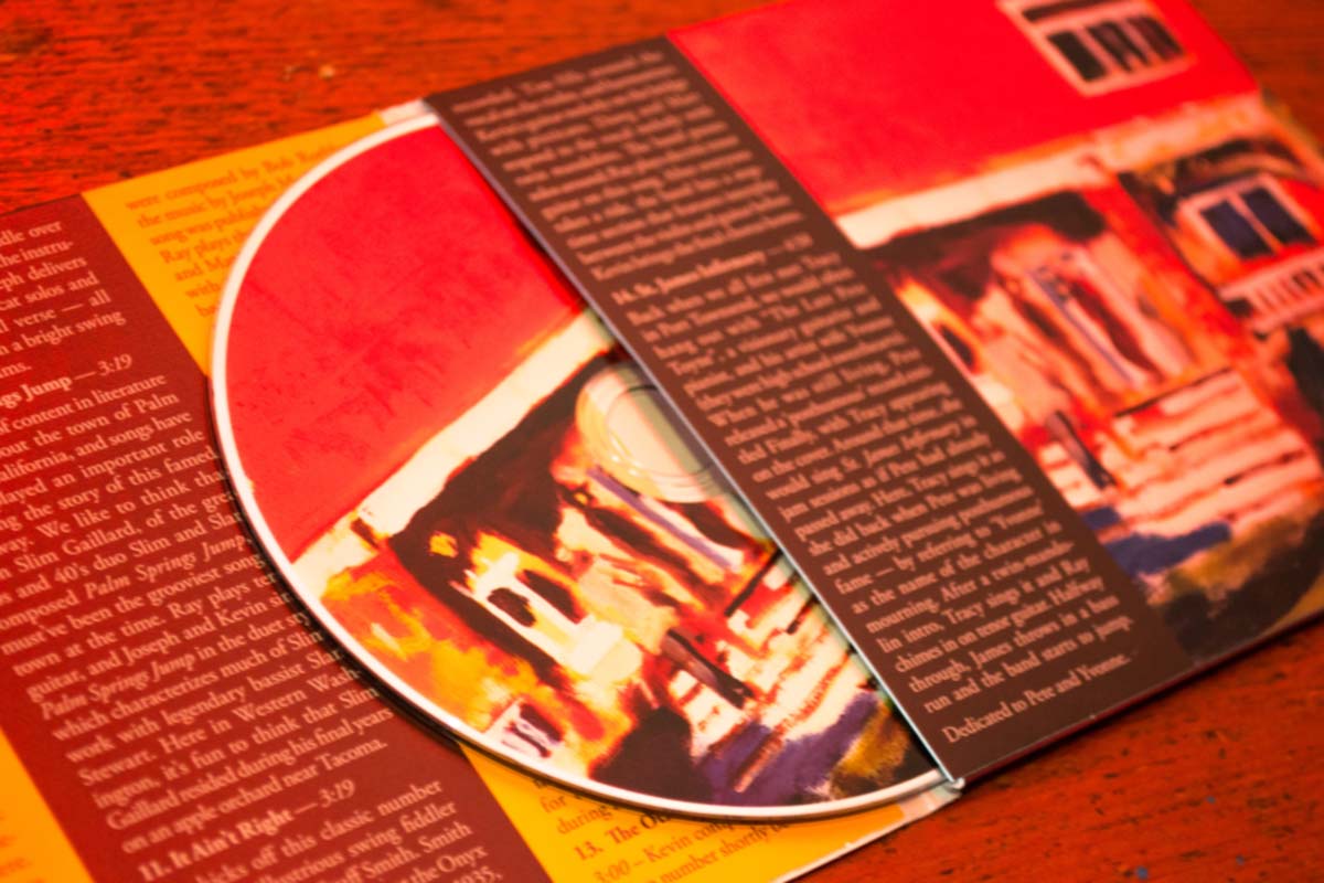
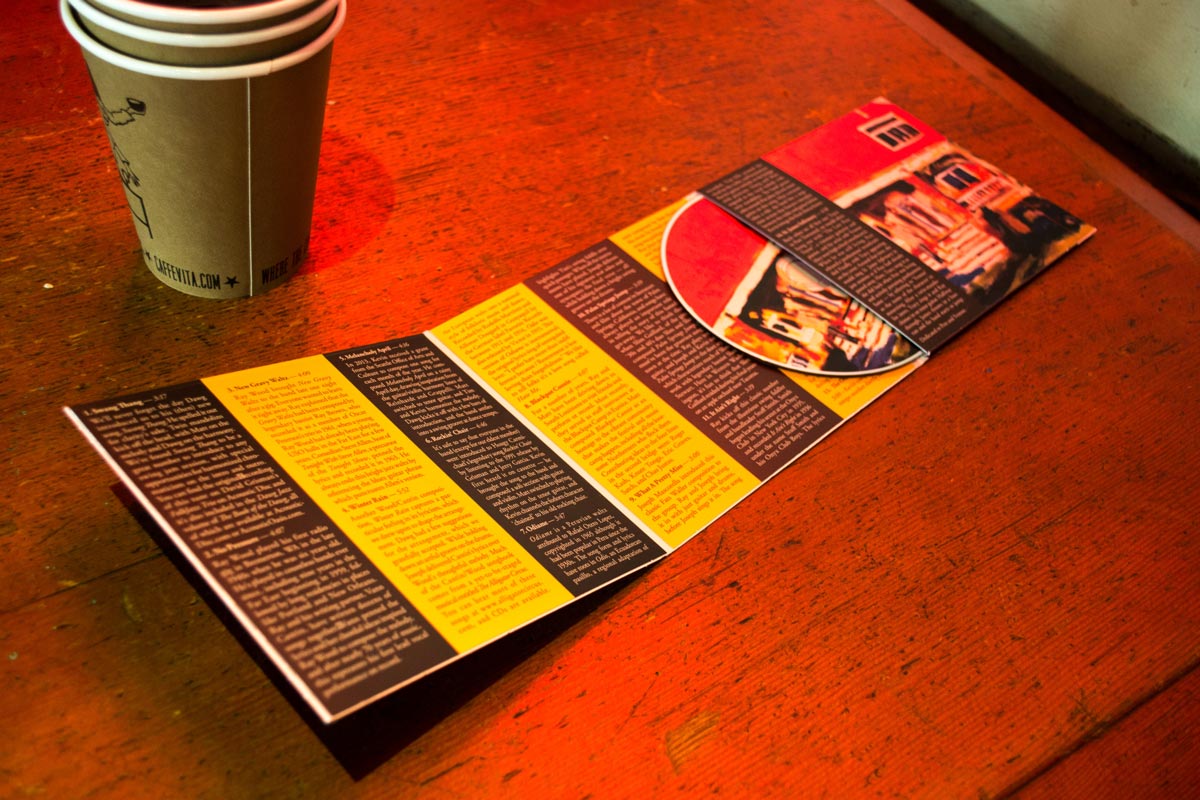
Hot Club Sandwich
As the band Hot Club sandwich prepared to release their 5th album, they found themselves in need of a layout! Artist Tracy Grisman was responsible for all the paintings. I wanted to evoke a classy and cozy feeling with the design, as that's how the music makes me feel. Listen to a track here, featuring my brother Jojo singing and drumming.
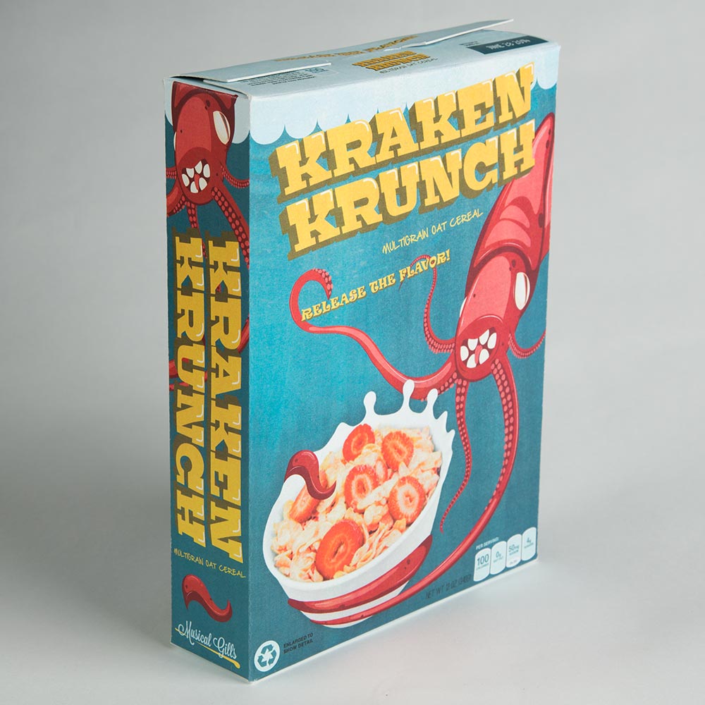
Kraken Krunch
I studied other children’s cereals to help capture the mood and energy of a cereal you’d want to eat on Saturday morning. By referencing certain packaging conventions such as big bold type for the title, the cereal looks natural on the shelf while still having its own personality to help stand out. Kraken Krunch would most likely be sold at Trader Joe’s and features a primary color scheme and a bright friendly mascot that kids can connect with.

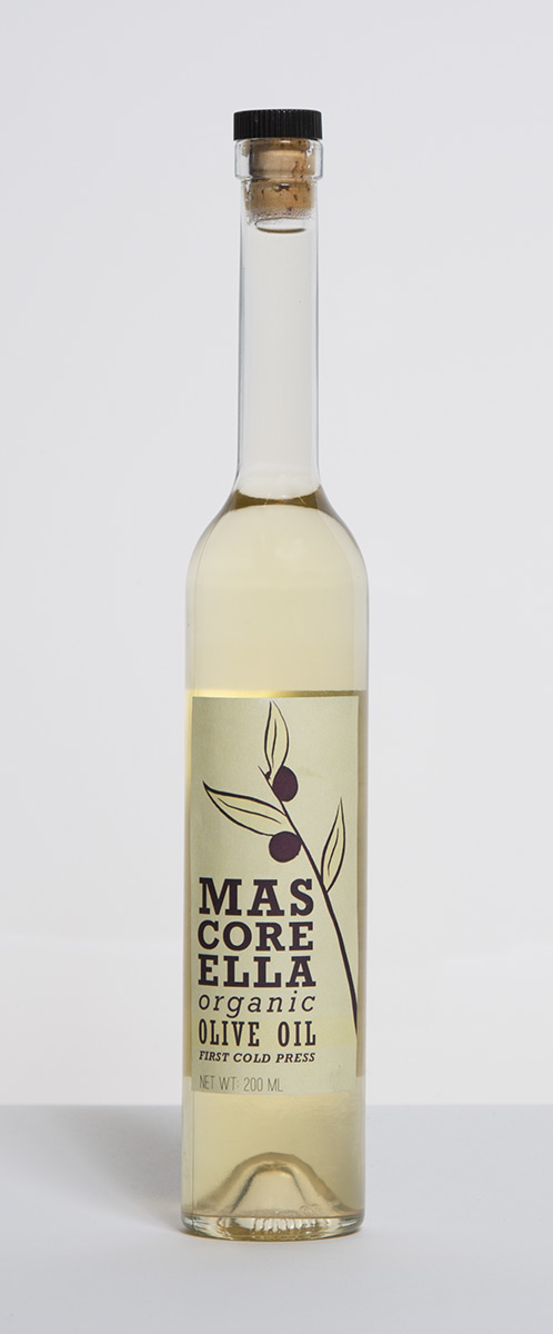
Olive Oil
To design a bottle, you first have to look at 100 other bottles! The shape of the bottle was a fun challenge, forcing me to really think about what needs to go where.
The typefaces are all various forms of Rockwell. I chose the typeface because it has many different fonts, allowing for easy variety that families well. The slab serifs add strength to the brands identity, and I chose to include a traditional simplified illustration of an olive branch to strengthen the elegance of the design.

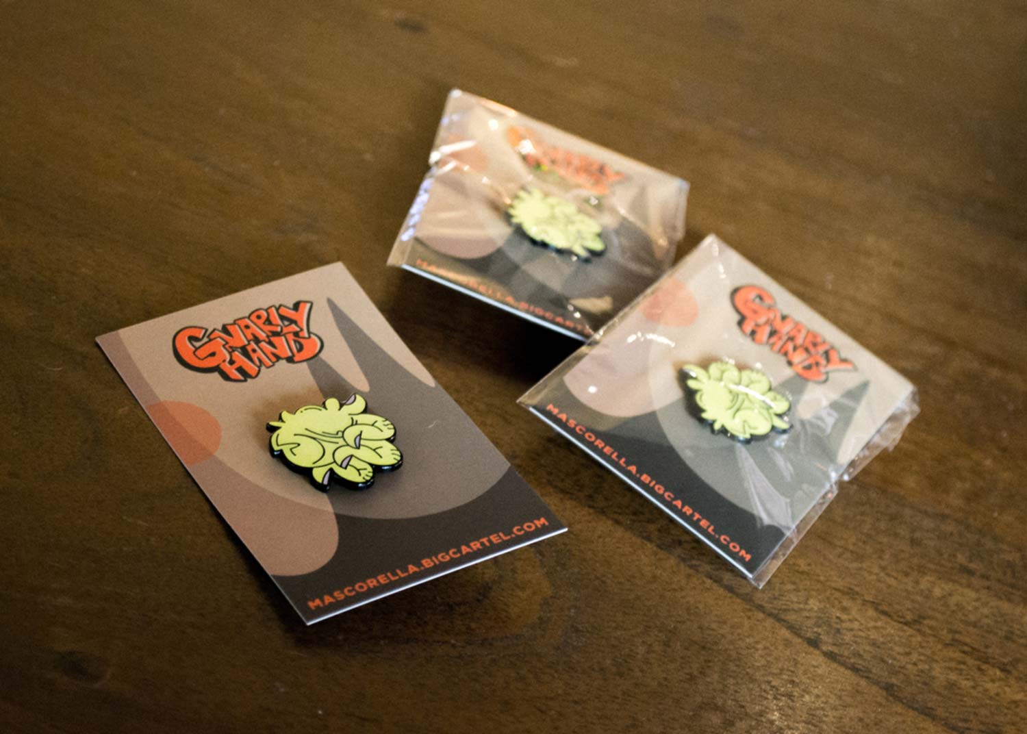
Gnarly Hand
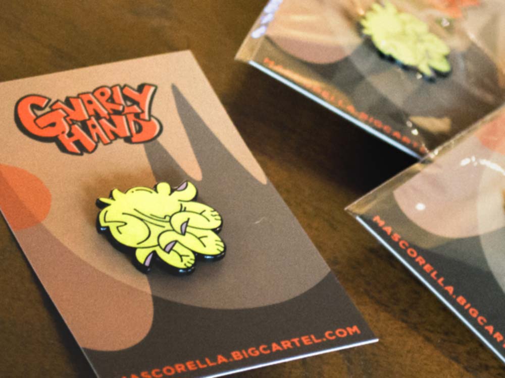
I wanted to make an enamel pin as it seemed like something that would have a satisfying result without taking too many components. One file for the pin and one for the backing card, and that's it! They've made great lil gifts.
Gnarly Hand
I wanted to make an enamel pin as it seemed like something that would have a satisfying result without taking too many components. One file for the pin and one for the backing card, and that's it! They've made great lil gifts.
Other Projects
Art GalleryIllustration
the bird and the beeMerch Design
Periodic TablePuzzle Design
SIFFFundraising Campaign
PackagingProduct Design
CrunkComic Book
Dirk GentlyBook Design
